
Design dilemma: a simple tip for deciding on paint colours
Why nature-inspired paint tones are the easiest colour choice, and some shades I recommend for a calming interior

Choosing paint colours is hard, and at some stage, you just have to take the plunge. Next time you redecorate, I really encourage you to channel your inner Sophie Ellis Bextor.
I interviewed her once for a piece I was writing for Ideal Home – this was a couple of years ago, and I had about 15 minutes with her (me in a meeting room in Paddington, her in a taxi on the way to an event).
She made a passing comment about the fact that because she grew up in a household where she could do whatever she wanted to her bedroom, she didn’t get too stressed out about choosing paint and wallpaper for her home as an adult.
I gently probed and asked what her teenage bedroom had been like, not thinking she would be keen to share more personal details. I hadn’t had long to build up much of a rapport, and we were racing through the questions (never a great sign).
But she said that she used to paint big murals on her bedroom wall, using neon paints and sometimes substituting nail polish for paint when she didn’t have the colour she wanted.
So because she’d had this freedom to express herself on her bedroom walls when she was younger, in the same way we might have done through our clothes or makeup, she found design decisions later in life less of a big deal.
Her parents’ relaxed approach meant adult Sophie was able pick a colour for her living room without much thought or worry about getting it ‘wrong’ and felt free to express her personality.
Okay, so what about the rest of us who didn’t have quite such chilled parents? I get that decorating is expensive, so that makes it harder to make decisions. And painting is a lot of effort, especially if you’re painting the ceiling the same colour as the walls, which I’d generally recommend doing too.
You can scour Facebook Marketplace, complete consistent laps of local charity shops and second-hand furniture stores and strike lucky, and you can get creative with IKEA flatpacks – but you can’t change up a space without spending some money. You just can’t.
But if I had a pound for every time an interiors expert has given me a quote for a story along the lines of ‘paint is the cheapest, easiest way to transform a room’ I’d be able to buy a lot of paint. It’s a cliché I’m tired of hearing, and as with all clichés, there is some truth in it.
After Parkrun today, I left my phone at home and walked to a park nearby. I sat looking out at the view with an iced latte until an involuntarily deep exhale signaled that I’d actually chilled the hell out.
Young families came and went, clouds unfurled into nothing, and the longer grasses caught the light and tilted in the wind. I befriended a dog, throwing its ball back and forth, overheard conversations between girlfriends, and got some colour inspiration from nature that I wanted to share.
Whether you call it biophilic design, bringing the outdoors in, or just decorating with nature-inspired colours, the main thing is to remember that being indoors is always a compromise. We’re happier outdoors in nature, we feel calmer in open spaces, surrounded by the greens and blues of parks, woods, and beaches.
That said, we spend between 60 and 90% of our time at home, indoors. So it makes sense to a) think about air quality, avoiding chemical air fresheners, cleaning products and candles, b) dot a few houseplants around and c) decorate with colours we find in nature.
If we want to improve our well-being and happiness, a key step is to spend more time outdoors. And make our homes feel that little bit more in tune with nature (but more comfortable).
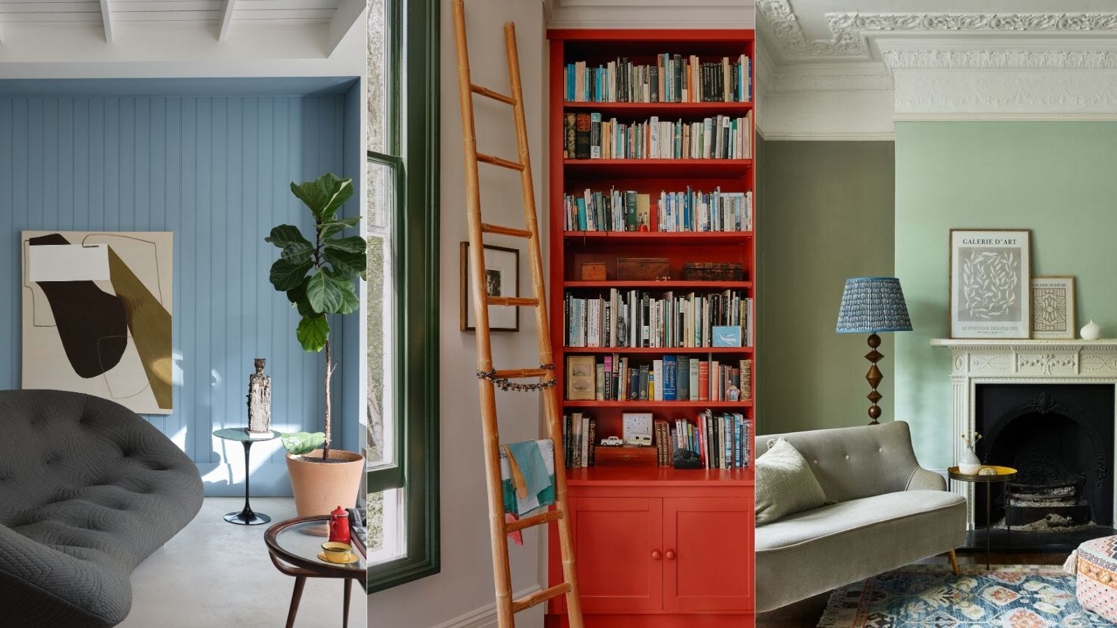
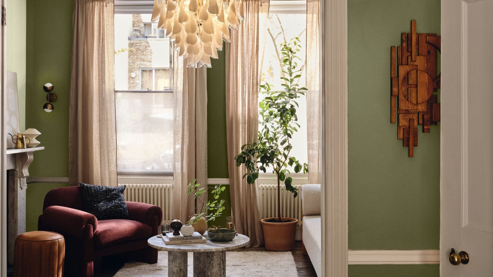
If you look closely at long grasses – the kind that are tempting to pull, collecting all their seeds – they’re made up of green, taupe brown and white tones.
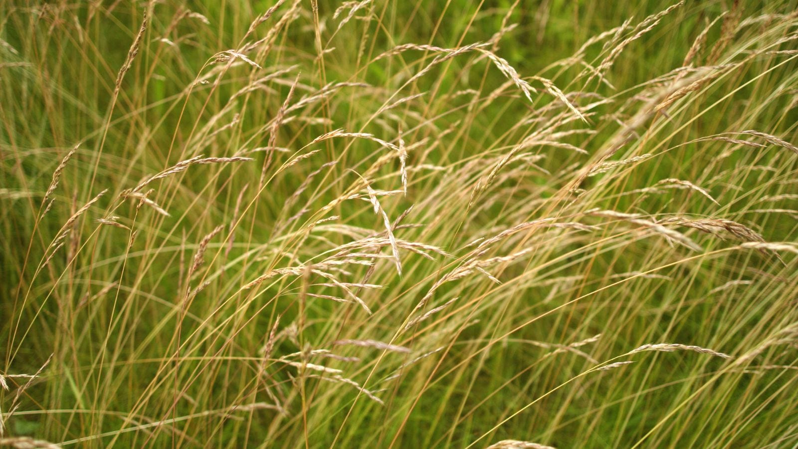
And these three colours: a soft green, brown and white would make a great colour scheme for any room. You’ve got nature-inspired neutrals, and green, which is basically a neutral too. I’ve suggested a few shades below.

Farrow & Ball’s Roasted Macadamia


Farrow & Ball’s James White, as this has a green undertone
As well as long grasses, there are lots of beautiful oriental poppies out right now, sprouting up like wildflowers around fences, adding bright orange and coral to the edge of garden walls and leaning onto the pavement. Coral is a great summer colour and I think an oriental poppy orange or coral is a beautiful accent shade to use when decorating.

Dulux’s Oriental Poppy, which is bright and uplifting, great for painting and upcycling wooden furniture but might be too intense for the walls in most rooms.
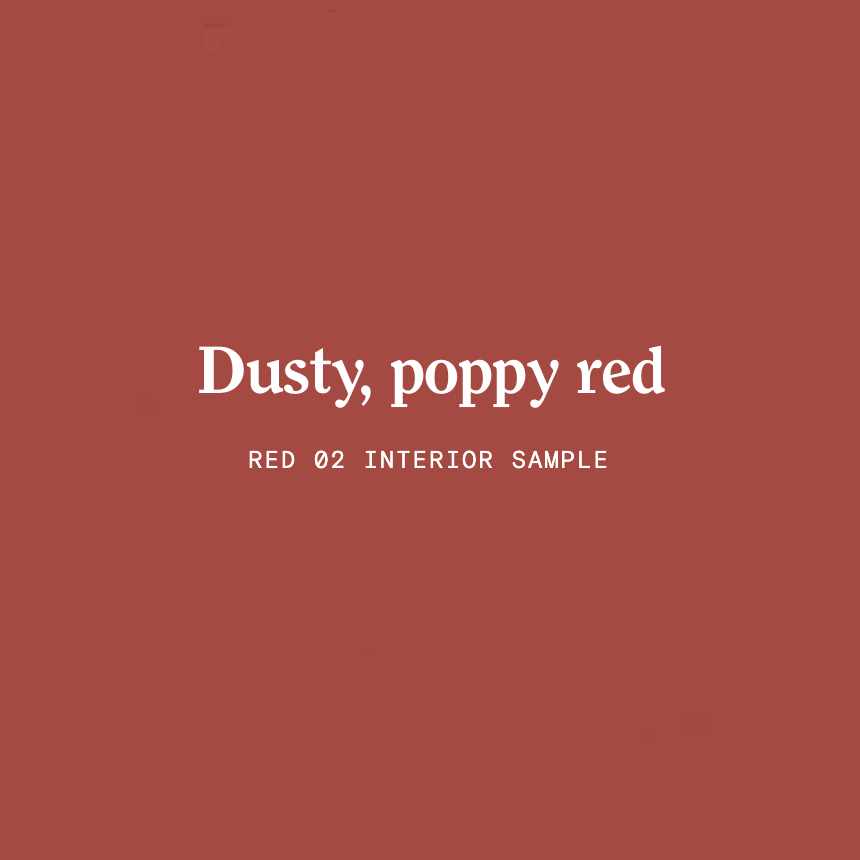
Lick’s Dusty Poppy Red, which is bold and warming.

Farrow & Ball’s Red Earth, which is a little softer and more liveable.
You could also look for some new bedding in these shades as a way to update bedrooms, or find inexpensive prints, cushions, and decor pieces to bring some of this warm and uplifting colour to your home.
Either way, don’t overthink it – Sophie Ellis-Bextor wouldn’t.